
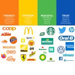
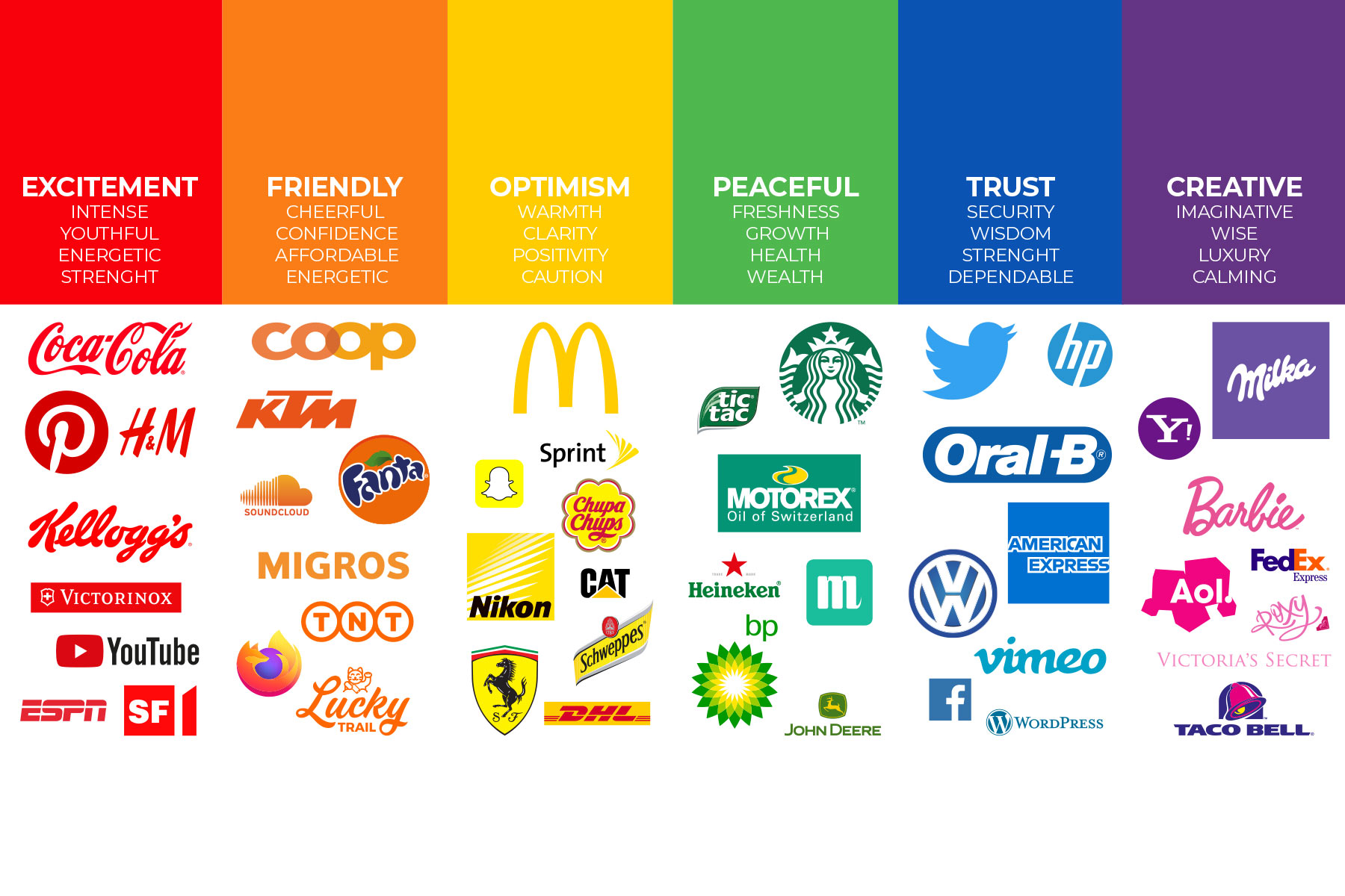
Steer with colors
Purple? Milka, of course! Mmmh ... delicate chocolate, 100 % alpine milk and yes, the cow with the "Muuuh". Or a red surface with sweeping white lettering? Even from miles away we know exactly: it says “Coca-Cola” - and somehow we suddenly feel like a refreshing lemonade. Two prime examples of successful color branding. Would you like to master the play of colors? We explain the rules to you.
How can the viewer's focus be directed?
On the one hand, of course, there would be the layout, e.g. B. a website or a magazine, which creates the cornerstones of the presentation, especially with type area, writing, white space and text-image ratio. This scaffold ensures that the viewer's eyes do not hover around aimlessly and helplessly in search of essential information.
Colors support this communication in several ways:
We can not only use them to better direct attention to certain content by using signal colors for signal words - a simple example - but also to arouse certain emotions. In the web area in particular, we at Cloud Connection like to use colors to draw the user's attention to the most important elements and to navigate them through the offer. And since the colors should correspond to the product properties, it is not brown and ocher that are used for sporting activities, but rather purple and turquoise (see also our example 1 below).
A project = a color scheme
When it comes to color branding, it is important to design all communication channels (website, print, newsletter, etc.) uniformly within a project. In this way we achieve an instant recognition value among the viewers. We mark differences in content with color contrasts. Attention: Always pay attention to the legibility of the texts - sounds banal, but is often forgotten.
Which color combinations suit my company?
- Choose your "basic color". Think about it: What are the key messages of your company? What emotions do you want to trigger in the viewer? Which color best expresses this? Fun fact: According to a study, the ugliest color on the Internet is a shade of brown, while the most beautiful is blue. Right? Isn't that right? Difficult to say, because in the end it is of course always about the overall concept.
- Now add additional colors. Based on your basic color, choose the colors that harmonize well with each other. Rule of thumb: complementary colors result in a dynamic design, analog colors have a calming effect. Sounds complicated? We at Cloud Connection are happy to create and explain different color variants for your basic color.
- Don't get into a frenzy of colors. More than four colors (1 basic color + 3 harmonizing colors) create unrest in the concept: Instead of drawing the viewer's attention and showing him important information, the colorful color soup only confuses him. But don't worry, there is always a lot of creative scope that we would be happy to take advantage of together with you.
Take the Corvatsch ski service
For the Skiservice Corvatsch website, we opted for the analog colors violet and turquoise, i.e. those colors that lie side by side in the color wheel. The color gradient in the lettering creates a both colorful and calm design that awakens and supports the associations “active”, “sporty”, “nature”.

We have made the Skiservice Corvatsch catalog even more colorful, because a print medium is always a bit more "static" than a website and this can be counteracted with colors. That is why we combined analog colors with complementary, that is, opposing, colors, e.g. B. with yellow, purple and aqua to achieve a particularly lively design.


